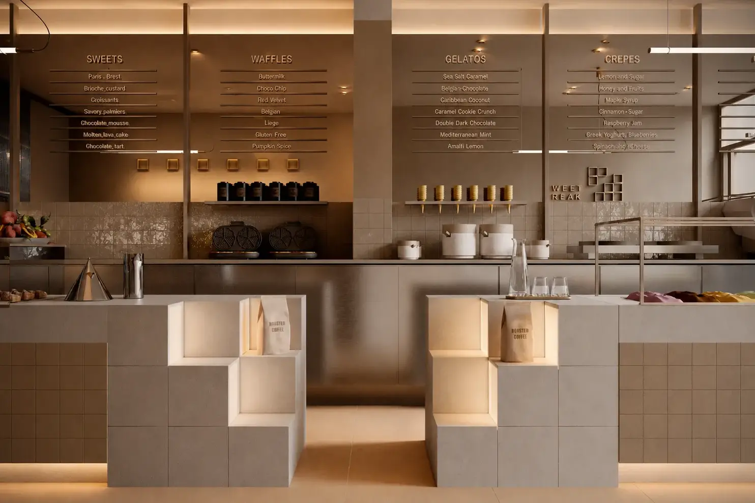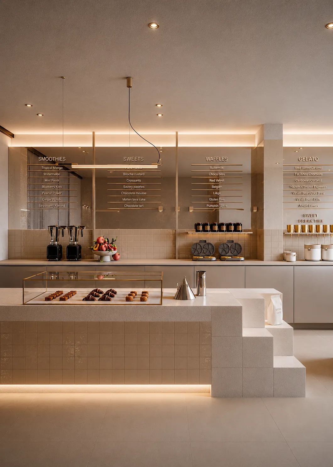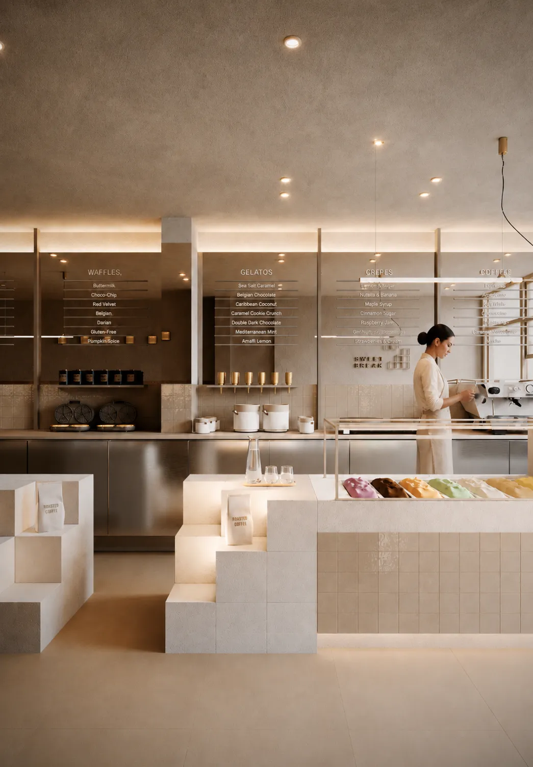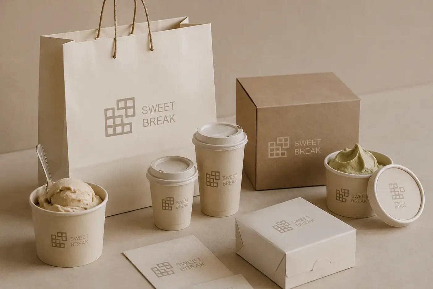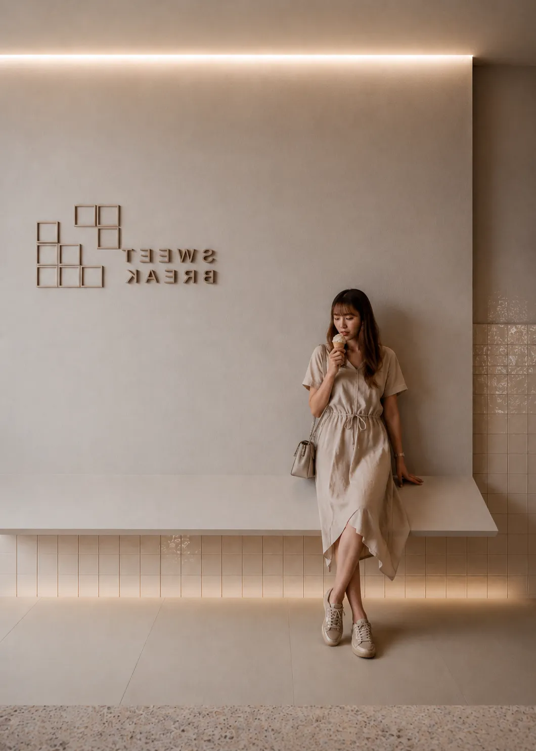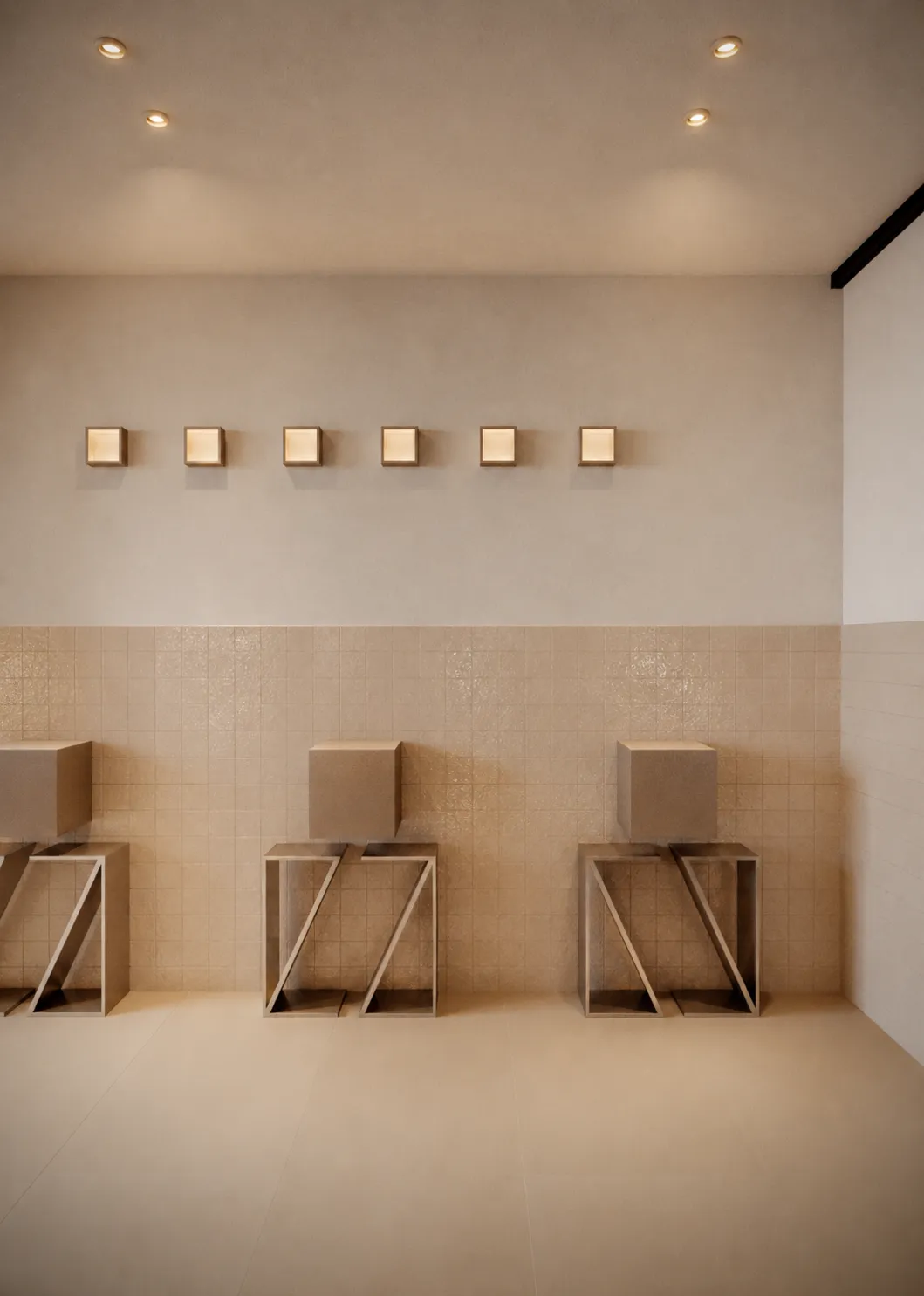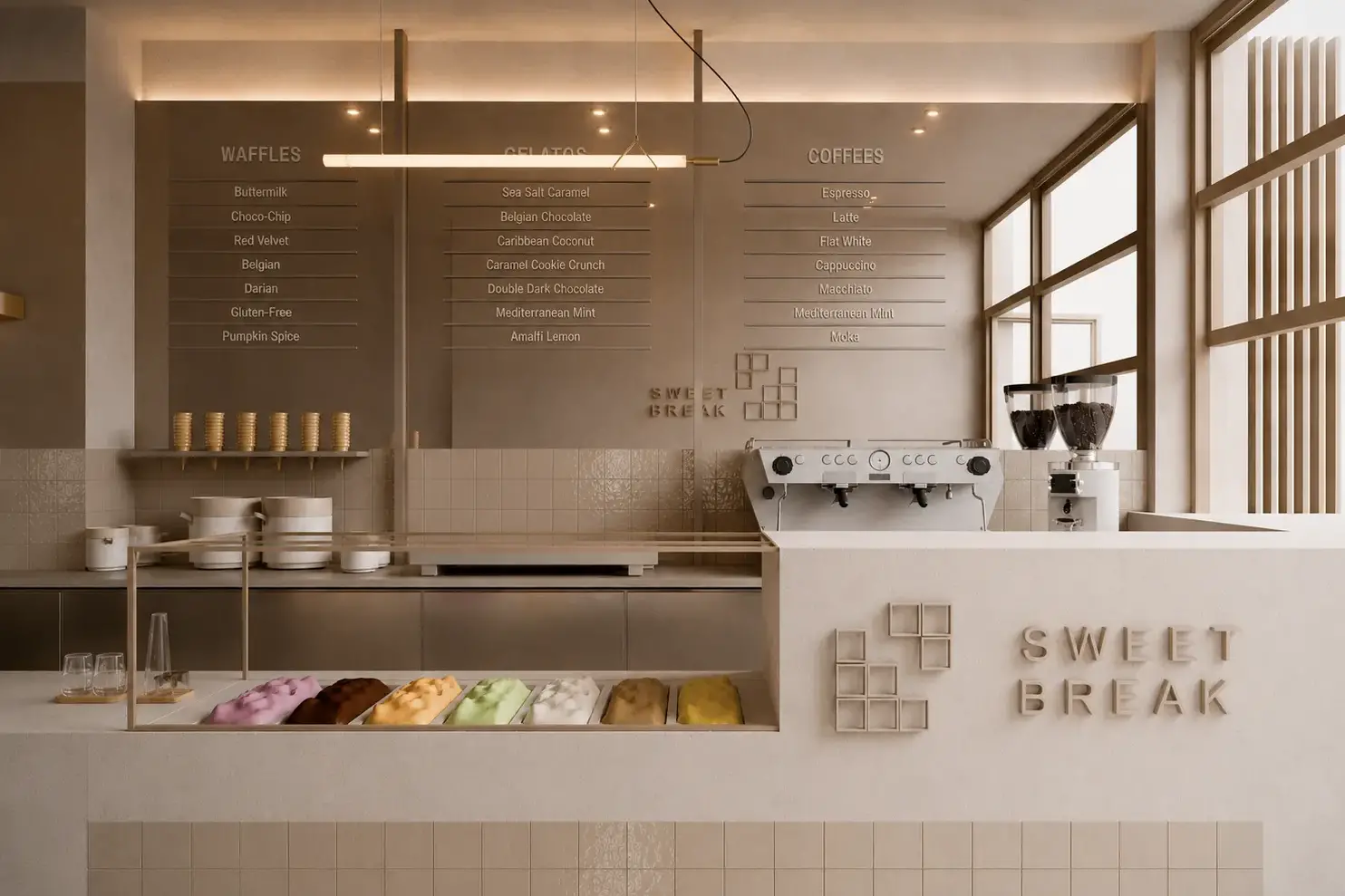
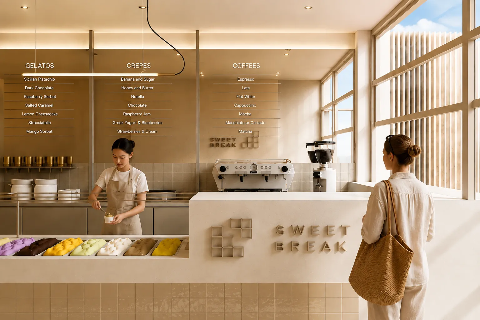
Sweet Break was designed as a space that offers a small escape from the rhythm of everyday life. One of the main design challenges was the coexistence of multiple functions — coffee, crêpes, waffles, gelato, smoothies, and desserts — within a single unified space without losing the clarity and cohesion of the aesthetic language. For this reason, the back wall was organized into clear product categories, allowing visitors to easily understand each function and move naturally through the space. The Sweet Break logo was designed to simultaneously reference the idea of a “break” while also subtly connecting to the products and overall experience of the store. Its fragmented geometry recalls a piece of waffle breaking apart, a small bite, or a fragment detached from a dessert, reinforcing the brand’s relationship with the dessert concept. The narrow geometry of the shop became the foundation of the spatial strategy, organizing the floor plan around a strong linear axis. Visitors gradually move through different product zones and service points, experiencing a continuous sequence of movement and discovery. A key element of the composition is the opening between the counters, where the staff crosses the space to serve customers. This point functions both practically and symbolically, reinforcing the idea of the “break” within the spatial experience itself. Mirrored surfaces and menu walls visually expand the narrow interior, multiply light, and enhance the sense of depth and openness, transforming reflections into a central tool of the spatial experience. A sculptural seating element defines the entrance of the store, functioning simultaneously as a waiting area and as a spatial gesture within the composition.
Sweet Break was designed as a space that offers a small escape from the rhythm of everyday life. One of the main design challenges was the coexistence of multiple functions — coffee, crêpes, waffles, gelato, smoothies, and desserts — within a single unified space without losing the clarity and cohesion of the aesthetic language. For this reason, the back wall was organized into clear product categories, allowing visitors to easily understand each function and move naturally through the space.The Sweet Break logo was designed to simultaneously reference the idea of a “break” while also subtly connecting to the products and overall experience of the store. Its fragmented geometry recalls a piece of waffle breaking apart, a small bite, or a fragment detached from a dessert, reinforcing the brand’s relationship with the dessert concept.The narrow geometry of the shop became the foundation of the spatial strategy, organizing the floor plan around a strong linear axis. Visitors gradually move through different product zones and service points, experiencing a continuous sequence of movement and discovery.A key element of the composition is the opening between the counters, where the staff crosses the space to serve customers. This point functions both practically and symbolically, reinforcing the idea of the “break” within the spatial experience itself.Mirrored surfaces and menu walls visually expand the narrow interior, multiply light, and enhance the sense of depth and openness, transforming reflections into a central tool of the spatial experience.A sculptural seating element defines the entrance of the store, functioning simultaneously as a waiting area and as a spatial gesture within the composition.